When you're building a website for your business, it's easy to get so caught up in the excitement of what you want your site to look like that you end up neglecting the design details. Unfortunately, without close attention paid towards making sure your site is user-friendly and efficient, you might be putting people off from visiting. That could be detrimental to your online success!
Here are some common mistakes people make on their websites:
1. No Clear Call to Action

A product release with no accompanying marketing plan isn't going to be tremendously successful--the same goes for a website. Whether it's "Sign Up," or "Email Us," you need some type of CTA (call to action) directing people toward the next steps. This will increase the level of interaction you receive from your visitors.
Each page should have a goal, whether it's selling a product or getting them to sign up for your email list. Specify the goal and place a prominent button or link that entices the user to follow through.
Consider these other helpful tips in improving your CTA:
A. Use the Power of Social Proof
Don't ask your visitors to trust you. Instead, let them see others do it first! Add a testimonial or quote from an existing customer right under your call-to-action button. You can even go further and add that customers' photo next to their quote.
It helps people imagine themselves in the place of other visitors and makes them act accordingly. Also, make sure to use quality images with real clients, which will help you build trust as well as increase conversions.
B. Draw Attention with Color Psychology
Colors are not just colors! They have different meanings depending on where they're used. For example, red is usually associated with "stop" and makes your visitors pay more attention. It's a very eye-catching color, which provides higher conversion rates for CTA buttons.
C. Be Generous

People respond better when they can get something for free or at least a reduced price, especially in comparison to what your competitors are offering. For example, if you run a SaaS(software as a service) business, you can offer a limited-time free trial version of your services, which will encourage people to try them and become potential paying customers later on.
D. Use Persuasive Words
Make sure that all highlighted words in your CTA copy sound as strong as possible, so people feel encouraged to follow through with their decision and accomplish the intended action quickly (e.g., buy, get started, click here, etc.)
Also, try to use words such as "now" or "immediately" that have a strong influence on people and motivate them to convert immediately instead of postponing their decision for later.
E. Leverage Urgency

When people notice that they are not the only ones willing to accomplish a particular task, they are much more likely to act as well. For example, you could add an optional countdown timer at the bottom of your ad with an appealing title like "Hurry up! Only x hours left until the offer expires!" This will encourage your visitors to respond quickly before it's too late!
F. Improve Readability
It might sound counterintuitive, but some people are put off by big blocks of texts. To provide a better user experience, break up your CTA copy into short and clear sentences to avoid overwhelming visitors who just skim through the content instead of reading it carefully from beginning to end.
G. Don't Be Afraid to Experiment
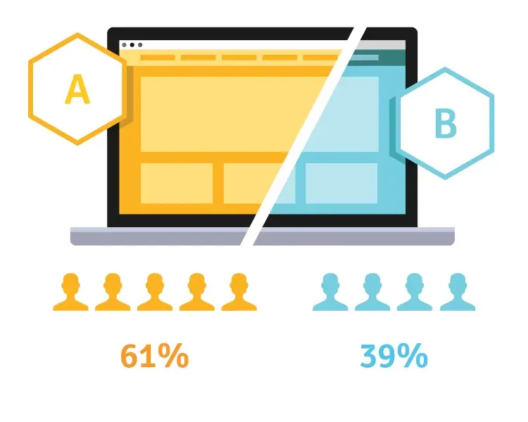
A/B testing is a cheap and easy way to find out what will work the best for your business and which type of CTA copy performs better than others. To avoid making mistakes, start small with one variable at a time (e.g., color or wording) and only change one element that could influence conversions the most before moving on to another variation.
H. Add Directional Cues
When people are confused about where they should click because there's no obvious call-to-action button or they get distracted by other elements on your page, they likely won't act at all! Therefore, make sure you always include visual clues such as arrows or contrasting colors to lead their eyes toward the desired action and make it as obvious as possible.
2. Unreadable Content

If your users can't read your text, then they're not going to want to engage with it. Just like you need readable books for school, you need readable content for your website.
One method is making your text more readable and engaging. More "readable" doesn't mean writing in baby talk, or liberally peppering your copy with pictures. It means writing in an easy-to-understand voice that fits what they're looking for.
A. Target Your Content to Your Audience

Make sure you know who you're talking to, before hitting "post." If you want to reach a broad audience, use simple language. Be aware that complex words may alienate some readers if overused.
People with very specific needs want clear, jargon-free content. Think about your audience, and you'll write a better piece of content that appeals to a narrower group of prospects who need what you're selling. Consider making a buyer's persona to know who you're addressing.
B. Use Headlines Like a Pro
Your headline should be engaging and draw your readers into the content you've written below it. It should also give them an accurate idea of what they'll find if they read all of it.
Use strategic keywords at the beginning of your headlines, so your visitors can easily spot those phrases while scanning their search results. Also, use numbers and short, pithy statements where possible: "9 Tips For Writing Better Headlines" is better than "Some ways you can write better headlines for web content."
C. Use a Readable Font Size and Typeface
Not everyone has perfect eyesight, particularly if they're over 40! Make your content easier to read by using a font size that's larger than normal. Fonts are also extremely important. If you use a difficult-to-read font, people may not even bother reading it and just move on without giving your business another thought.
D. Use a Readable Contrast Rating
The contrast between your font color and the background color is also an important factor. For example, black text on a white background or dark gray on light grey may be too difficult for some people to read, particularly if they're looking at the content in bright sunlight. It's a good idea to use colors with sufficient contrast so everyone can read what you've written.
E. Make Your Language Clear and Conversational

People want to interact with businesses that address them directly rather than sounding like a robot. You should use phrases such as "we" instead of "the company" when possible.
Keep it simple even when explaining complex ideas and processes. Your customer is much more interested in understanding how your product or service can help them than in reading a snappy blog post.
F. Use Bullet Points and Lists Where Possible
Most people love lists. They make it easier to scan information quickly and get results when searching for specific topics. They also break up long monotonous paragraphs of text into bite-size chunks that are easy to digest.
3. No Mobile Compatibility
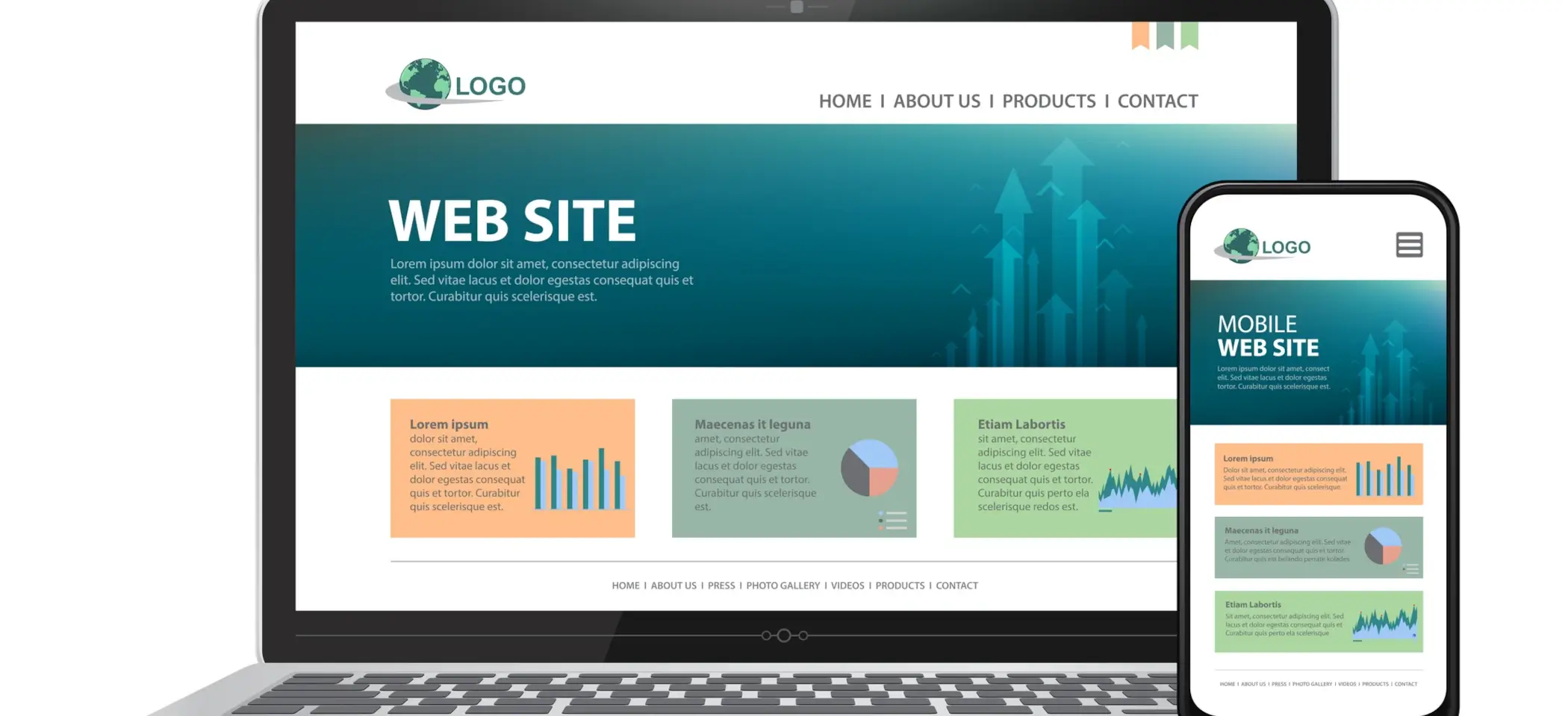
With an estimated 50% of users now buying products online using their smartphone, if you're not catering your site toward mobile devices, then it is drastically reducing your chances of conversions.
But how can a mobile-friendly and responsive website help your business?
- People are using mobile devices as their primary means to surf the Internet. To be competitive and make your business grow, you need a mobile-friendly site.
- Mobile-friendly website designs provide an optimal viewing experience on all devices, giving your customers a consistent web browsing experience across desktop and mobile devices.
- According to Statista, during the first three months of 2019, over 40 percent of the global online population performed voice search using any device within the previous month. Of these, mobile devices comprised more than 50 percent of organic visits on search engines in the United States.
- Mobile-friendly sites will boost your search engine rankings. In fact, Google is now using a mobile-first indexing process, and how you perform on mobile devices can now affect your overall search engine ranking.
- Mobile site traffic outperforms desktop by more than ten times. A large e-commerce study found that the average order value per visit was 53% higher on the company's smartphone site compared with the desktop site.
- Having a mobile-friendly website will help you generate more revenue. By having a mobile-optimized website, you can provide the best and most relevant information to your targeted customers, which increases the chances of getting conversions.
4. Poor Presentation
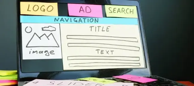
What first draws a user to your website? It's the visual information presented on the homepage. If you want them to stick around for more than five seconds, then the site needs to look professional--clean, concise, and well-placed graphics are a must.
Think about these other mistakes as well:
- Bad Search Functionality: Make sure there's an easily accessible search bar somewhere on the page so that people aren't clicking through multiple pages just trying to find what they need. Search functions should automatically include all files for a given company as well as any relevant terms used in other areas of the site.
- Pop-Ups: Nothing is more frustrating to a user than a pop-up that interrupts their experience. Everyone hates them, including Google, which has been known to penalize sites with pop-ups in the past. Don't let your website suffer because of an annoying pop-up--banish them from your site and reap the rewards.
- Not Enough Visuals: Consumers need to be able to see your product to understand it and make a decision about whether or not they want to buy. Showcase images of your product from all angles--the more high-quality visual content you have, the better!
- Too Much Text: It's always best practice to use as few words as possible when creating sales content. Think about how you can say something in fewer words to make it more powerful! Anything extra (such as excessive flourishes or unnecessary adjectives) will only deter people from your site without adding any value.
- Too Cluttered: Nobody wants to deal with a messy web design. It makes for a negative experience which will put people off visiting in the future. Keep things clean and organized by sticking to white space and reducing clutter possible. For inspiration on how to do this, check out sites like iOS and Spotify.
- Broken Links: When a link on your site stops working, people will be unable to complete the task they were trying to accomplish. This is annoying for users and can also harm your rankings in search engines due to broken links being seen as quality issues within web design. Fix dead or broken links by updating old content or turning them into internal links that point back up toward their original destination page.
- No E-commerce Functionality: If people are looking for something, make it easy for them to find it and buy it! People aren't going to stop what they're doing and look around for what they need. They expect ease and convenience in their shopping experience just like you would at a brick-and-mortar store. Add an "Add to Cart" button on every product so that users can purchase products without having to click through multiple pages.
- Shopping Cart/Email Capture Hard to Use: The easier you make it for a user to engage with your site, the more likely they are to do so. That means that you need to make it easy for them to check out and give you their money as well! Using shopping cart software or third-party services will enable your customers to move through the checkout process more quickly, ultimately leading to more conversions.
- Missing Social Media: The whole goal of having a website is so that people can find it and spread the word about what you're doing. Don't leave out any of the major players in the social media world--get yourself set up on Instagram, Twitter, Facebook, Pinterest--whatever else might be relevant for your particular audience! Add visually appealing social media buttons on essential homepages and blog posts.
- Poor Site Structure: Your site's hierarchy should make it easy for visitors to find what they're looking for--intuitively organize information so people don't have to hunt around for what they need. Make sure that important calls to action are easy to find on every page of your site, and subpages link back up to the homepage. This will keep people from getting lost when navigating around.
5. Missing or Incorrect Information

One thing that's sure to get potential customers running in the other direction is if they can't find anything about what makes you better than your competitors. Make sure that every aspect of your site has relevant and up-to-date information that showcases why people should choose you over someone else.
Watch out for these common missing or outdated types of information:
- Lack of Contact Information: There's nothing wrong with keeping things completely anonymous, but one huge downfall is having no way for users to ever get in touch--not even a phone number or email address! If there's an issue with their order, or something isn't quite right, make it easy for them to contact you and resolve the problem.
- Missing Copyright Info: Copyright information is necessary not only in protecting your work but also in providing users with proper credit if they decide to share one of your pieces. By embedding metadata into images, you can automatically provide this information whenever an image is shared (this will help with branding and give credit where it's due).
- No Privacy Policy: A privacy policy is essential to convince people that they can trust you with their information, and it also reassures them that your site is legitimate by providing transparency. This starts with a clear statement of what data will be collected and why, as well as how long it will be stored and who has access to it.
- Missing Mobile Options: If you haven't optimized your site for mobile devices, many people won't bother visiting in the first place. After all, who wants to waste their time on a page that doesn't even work well on smartphones? Make sure that it's easy for visitors to contact you directly from any device by sticking to a responsive mobile design.
- No Guarantee: A great way to boost conversions is by offering a money-back guarantee. This reassures users that they have nothing to lose, which can significantly increase the chances of them purchasing from you.
- Hidden Costs: Nobody likes hidden fees or additional charges when making purchases online. They make customers feel like they're being taken advantage of. To increase conversions, be clear about your payment terms from the get-go (including any delivery charges, taxes, or product alterations).
- No Security: Since payments involve sharing personal information online, fraud is always a risk. To boost confidence in your site's security and avoid losing sales to competitors with better reputations, you should have an SSL certificate installed by default. This encrypts all data sent to and from your website so that it can't be intercepted or stolen.
6. Lack of or Insufficient Site Optimization

Why do you need to optimize your website? You can rank high on the search engine results page (SERP), which ensures that the maximum number of visitors reach your site. This increases the chance to convert casual visitors into potential buyers/customers.
Optimized websites are easy for users to use and navigate, which means increased browsing time and better user experience. Search engines love optimized websites because they follow the latest web standards resulting in ranking high on SERPs.
Your browser response time will improve drastically when the website files are stored in cache or memory instead of being loaded from a hard drive every time. A faster loading speed improves the conversion rate by 15%. The overall download time will reduce significantly, leading to less bounce rate.
One of the essential optimization techniques to do is on-page optimization. It refers to changes you can do on your website that improves its search engine rankings without affecting the user experience. This requires you to follow a number of guidelines and use SEO-friendly keyword phrases while writing content, which is then followed by web design changes that serve the same purpose.

The following factors determine where your webpage ranks in SERP:
- Keyword Density: The keyword density tells you how many times a keyword phrase appears on a web document out of 100 or total words used in that document. Although this has been discouraged by Google, it still plays an important role as it affects the relevancy score.
- Keyword Prominence: This refers to the placement of a keyword phrase where it appears on a web document. A good web page is one that ensures that your target keyword appears in Title Tag, H1 tag, and above the fold.
- LSI Keywords: If you are not familiar with Latent Semantic Indexing (LSI), it refers to keywords that have a similar meaning to your main keyword but don't match exactly as far as search engine optimizers are concerned. An example would be the keyword "weight loss." One can use "diet plans" or "fat-burning exercises." You need to find relevant keywords present on-page and include them in content because search engines consider these words if they find them to be related to the topic.
- Dynamic Keyword Insertion: This is a Google AdWords feature that lets you include your keywords dynamically in your ad copy based on information customers share with you. For example, if someone types "Dell Laptop $499" in the search box, then this keyword phrase will appear in Dell's ad copy along with their brand name and URL of the page where they can get more information about that laptop. Hence, advertisers don't have to build separate ads for each product or service they are offering. Optimizing landing pages using dynamic keyword insertion helps improve conversion rates.
- Link Popularity: The number of links pointing toward a webpage from other websites as well as the page rank of the other website determines where your webpage ranks in SERP. A good link profile is one that consists mostly of trusted websites and domain pages with a high page rank compared to a number of external links leading to your domain and landing pages.
- Meta Tags: This refers to HTML attributes used in the head section of web pages to provide information about the content on that page as well as its relevance toward search terms.

Other factors that may impact your site optimization include domain registration. The majority of search engines list all websites they find regardless of domain registration date but put a date against previously registered domains to indicate how old it is when listed in a SERP. The age of your website when indexed by search engines might impact user experience and also affect how well it ranks for a specific term if any competitors registered their domain earlier than you did.
Your site may perform rather poorly if you don't use analytics. Everyone knows that you need stats to gauge the success of your site, but not everyone uses them to their fullest advantage. If you want to optimize your website and make it better for conversions, then you need to have an analytics program that is set up correctly (Google Analytics) and properly integrated into your site.
Lastly, don't forget to add blog/sales posts. The longer someone spends on your site, the more likely it is that they've found something that interests them enough to convert into a sale. Use this insight by creating compelling sales content on your blog. This will help lengthen engagements and encourage users to spend more time on your site.
Your website is your storefront, so it's important to make sure you avoid making these critical mistakes. If you need help creating a successful online business strategy for your company, Greencheck.ai has more online business tips to guide you.
